SUBSCRIBER CONNECT

Subscriber self-service, reframed for mobile.

Subscriber self-service, reframed for mobile.

Subscriber self-service, reframed for mobile.

Adapting an existing desktop product into mobile experiences for new and active subscribers.

MOBILE UX/UI DESIGN

3 weeks / Creative Director + developers

ACCOUNT & BILLING

NEW-USER HOME

MY CONTRIBUTION

Mobile design. An existing product foundation.

Mobile design. An existing product foundation.

Mobile design. An existing product foundation.

ROLE

UX/UI Designer

Mobile app design

TIMELINE

3 weeks

Design engagement

TEAM

Creative Director &

Developers

STATUS

Not launched

No live outcome data

01 / STARTING POINT

Adapt the experience, not just its width.

Adapt the experience, not just its width.

Adapt the experience, not just its width.

Subscriber Connect already had a desktop experience. My scope was the mobile app: the new-user home and the account, billing, services and support screens.

Subscriber Connect already had a desktop experience. My scope was the mobile app: the new-user home and the account, billing, services and support screens.

Existing desktop design — starting point, not my design contribution.

THE MOBILE DESIGN CHALLENGE

One column. Clear priorities.

The desktop places several cards side by side. On mobile, their order becomes part of the experience.

The desktop places several cards side by side. On mobile, their order becomes part of the experience.

The work shown here focuses on account context, actionable summaries and progressively revealed details.

The work shown here focuses on account context, actionable summaries and progressively revealed details.

02 / NEW-USER HOME

Useful before the first bill arrives.

Useful before the first bill arrives.

Useful before the first bill arrives.

A new subscriber needs orientation before there is usage or payment history to show.

A new subscriber needs orientation before there is usage or payment history to show.

New User Home page / mobile viewport

Lead with the next event.

The scheduled installation is visible near the top, with its date, time window and a reschedule link.

Explain why a card is empty.

The invoice summary says when recharge history will appear and links to an explanation of the billing cycle.

Keep the main destinations close.

Home, Recharge, Services and Account remain available in the bottom navigation.

03 / ACCOUNT & BILLING
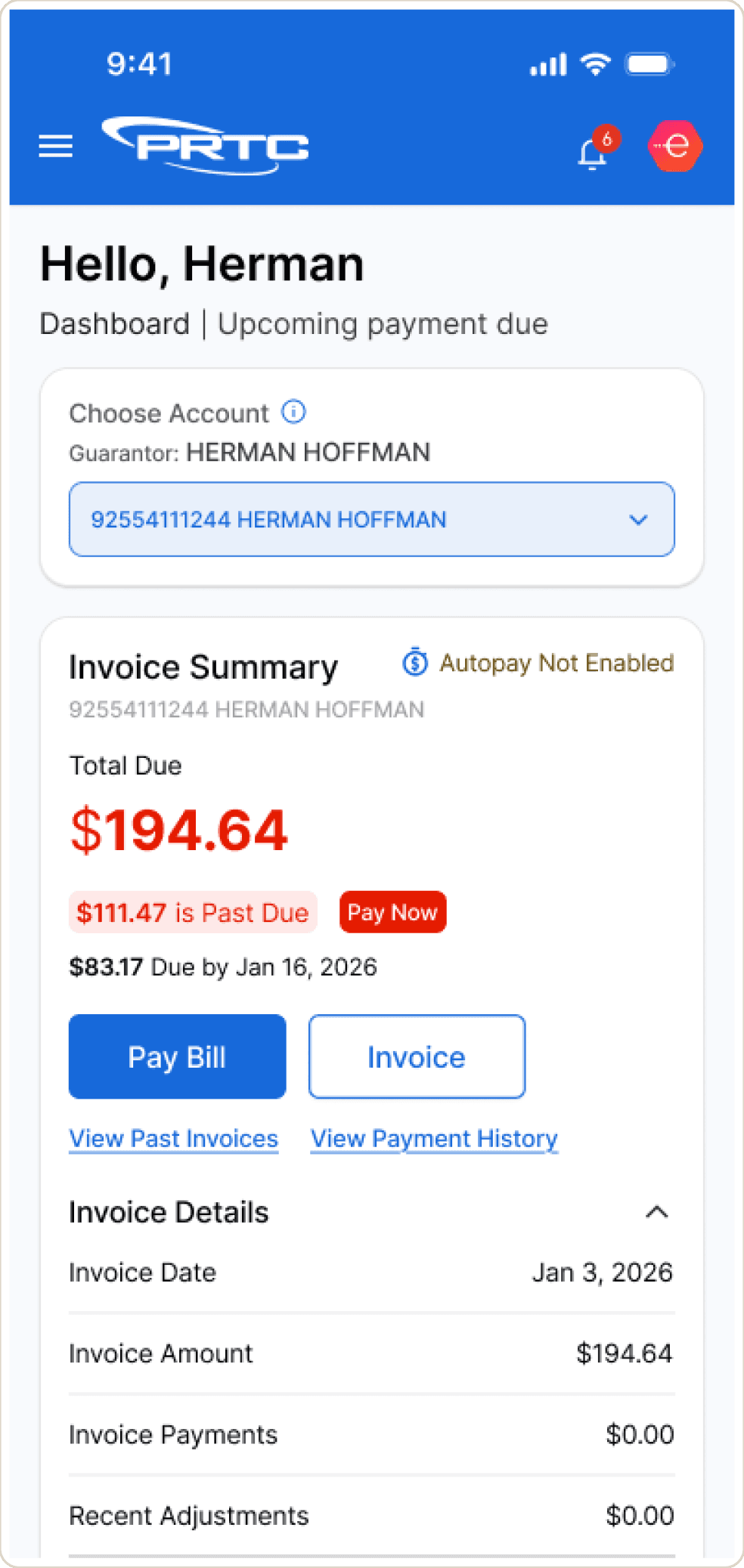
Context first. Amount next. Action close by.

Context first. Amount next. Action close by.

Context first. Amount next. Action close by.

Account selection sits above the financial information. The amount due, overdue label and payment action are separated from the detailed invoice rows.

Account selection sits above the financial information. The amount due, overdue label and payment action are separated from the detailed invoice rows.

DASHBOARD

INVOICE & PAYMENTS

Account context

A visible selector establishes which account the information belongs to.

Action hierarchy

Pay Bill is filled; Invoice is outlined. History links have lower emphasis.

Summary to detail

Totals come before the invoice breakdown, keeping the initial reading order focused.

04 / SERVICES & SUPPORT

Scan the overview. Open the detail.

Scan the overview. Open the detail.

Scan the overview. Open the detail.

Service and support screens organize dense account information into cards, filters and explicit status labels.

Service and support screens organize dense account information into cards, filters and explicit status labels.

SERVICE MANAGEMENT

Filters and search narrow the list. Expanded cards reveal service details; collapsed cards preserve the overview.

SUPPORT

Task shortcuts precede network status and ticket history. Open and closed states use words as well as color.

05 / UI CRAFT

A familiar visual language, carried into mobile.

A familiar visual language, carried into mobile.

A familiar visual language, carried into mobile.

The mobile screens carry the product’s visual language into a smaller format. These original interface details show the action hierarchy, blue accents, neutral cards and repeated navigation patterns.

The mobile screens carry the product’s visual language into a smaller format. These original interface details show the action hierarchy, blue accents, neutral cards and repeated navigation patterns.

DETAILS FROM THE ORIGINAL SCREENS

01 / Account selection

A repeated control keeps account context visible.

02 / Action contrast

Filled and outlined buttons distinguish payment from invoice access.

ACCOUNT SETTINGS

Related details are grouped into contact and security sections.

06 / SCOPE & COLLABORATION

A focused, three-week mobile engagement.

A focused, three-week mobile engagement.

A focused, three-week mobile engagement.

I worked with the Creative Director and developers to design the mobile app using the existing desktop version as the foundation.

I worked with the Creative Director and developers to design the mobile app using the existing desktop version as the foundation.

DESIGN SCOPE

New-user home and mobile self-service screens.

TEAM CONTEXT

Design direction with the Creative Director; collaboration with developers.

OWNERSHIP BOUNDARY

Mobile UX/UI adaptation. The existing desktop product is not presented as my work.

07 / DESIGN OUTPUT & NEXT STEPS

Mobile designs completed. Launch impact still to come.

Mobile designs completed. Launch impact still to come.

Mobile designs completed. Launch impact still to come.

The work covers the new-user home and mobile account management, billing, services and support. The app has not launched, so this case study focuses on the design output rather than measured impact.

The work covers the new-user home and mobile account management, billing, services and support. The app has not launched, so this case study focuses on the design output rather than measured impact.

PROPOSED VALIDATION — NOT COMPLETED TESTING

Account clarity

Account clarity

Can users tell which account is active?

Billing path

Billing path

Can they find the amount due and payment action?

New-user guidance

New-user guidance

Do they understand what happens before activation?

Next: validate core tasks with subscribers and update this story with observed results.

☰