☰

INNOVATION INCUBATOR / WEBSITE REDESIGN

An updated offering. A cohesive web presence.

An updated offering. A cohesive web presence.

A focused redesign of the AI/ML page, App Development page and homepage slider, bringing new releases, products and content into the existing brand language.

ROLE

UX/UI Designer

UX/UI Designer

All three designs

TIMELINE

2 days

2 days

Focused redesign

COLLABORATION

Creative Director

Creative Director

Developers

STATUS

Live

Live

Website redesign

Scope: selected website pages and a homepage slider — not a full-site redesign.

01 / THE BRIEF

Refresh the content. Keep the brand recognizable.

Refresh the content. Keep the brand recognizable.

Refresh the content. Keep the brand recognizable.

The brief was to update the website for new releases, products and content, while making the presentation more modern and staying within the brand styles.

CONTENT

Make the updated services and products easier to scan.

Make the updated services and products easier to scan.

Make the updated services and products easier to scan.

CONSISTENCY

Connect the three designs through a shared visual language.

Connect the three designs through a shared visual language.

Connect the three designs through a shared visual language.

TIME

Deliver a focused redesign within a two-day design window.

Deliver a focused redesign within a two-day design window.

Deliver a focused redesign within a two-day design window.

02 / SERVICE PAGE DESIGN

Different services. A shared structure.

Different services. A shared structure.

Different services. A shared structure.

Both pages begin with a concise proposition and a next step, followed by supporting context. A shared header, hero treatment and section rhythm connect the experiences.

AI/ML

Introduces the AI offering, then explains the capabilities, industry context and platforms behind it.

Introduces the AI offering, then explains the capabilities, industry context and platforms behind it.

APP DEVELOPMENT

Introduces the development offering, then expands into capabilities, engagement models and delivery.

Introduces the development offering, then expands into capabilities, engagement models and delivery.

03 / CONTENT HIERARCHY

Give technical content a readable order.

Give technical content a readable order.

Give technical content a readable order.

The capability grid groups each service around an icon, a clear heading and a short explanation. Consistent alignment and spacing make the categories comparable without flattening them into one long paragraph.
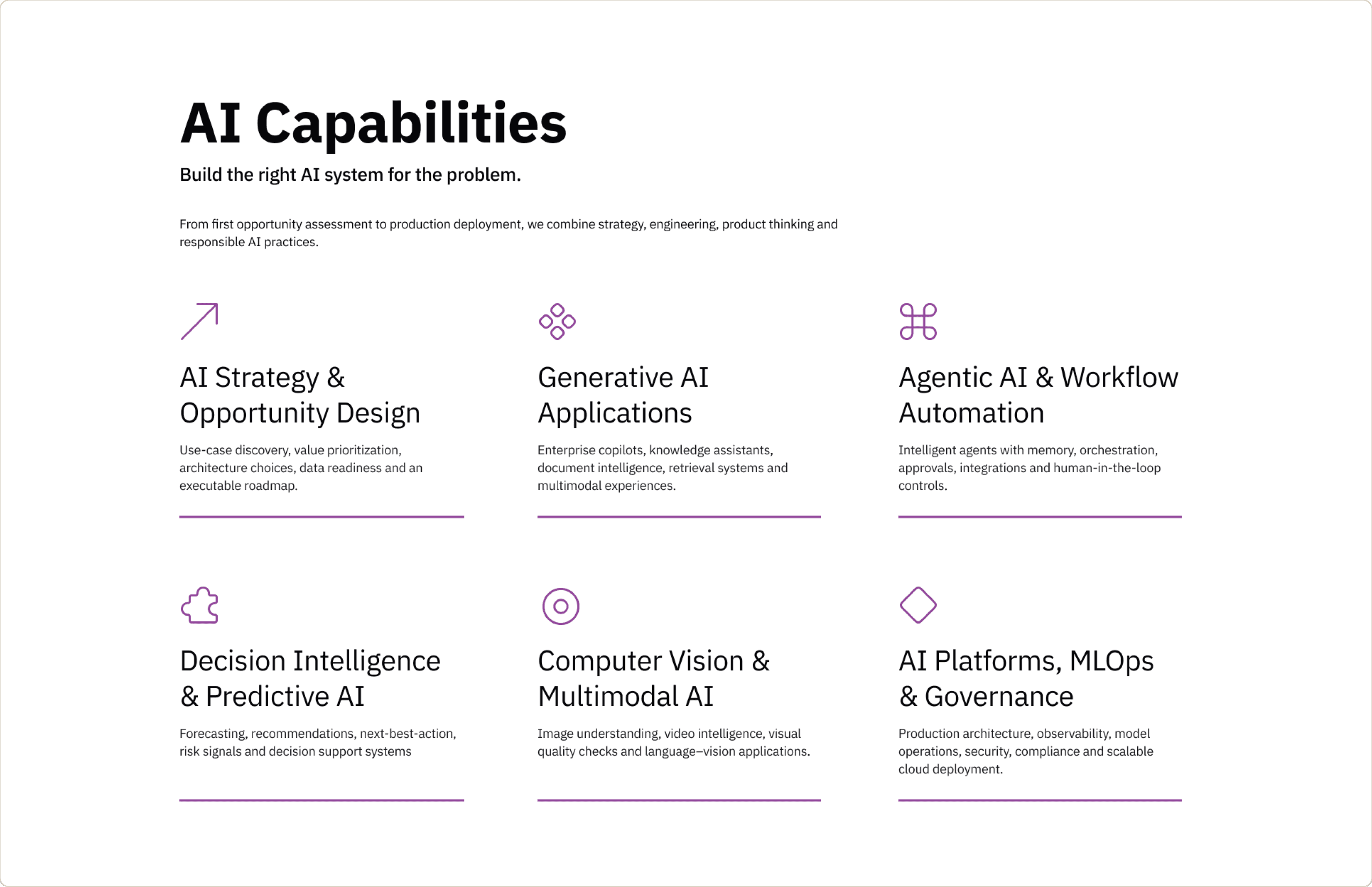
Design detail: repeated structure supports scanning; the copy carries the distinctions between services.

04 / PRODUCTS & VISUAL LANGUAGE

Bring the product offering into focus.

Bring the product offering into focus.

Bring the product offering into focus.

The AI-native platform cards give NerdAgent and HealthKarma distinct spaces within the same section. Dark product panels contrast with the lighter content areas around them.

PURPLE ACCENTS

Connect headings, icons and calls to action to the brand.

Connect headings, icons and calls to action to the brand.

LIGHT CONTENT AREAS

Separate long sections and provide room for reading.

Separate long sections and provide room for reading.

DARK HERO & CARDS

Give the opening proposition and product examples stronger emphasis.

Give the opening proposition and product examples stronger emphasis.

05 / ENQUIRY & REUSABLE UI

Turn interest into a clear next step.

Turn interest into a clear next step.

Turn interest into a clear next step.

The enquiry section pairs a short invitation with a labeled form and a visible submission action. It gives visitors a place to describe their requirements after exploring the offering.

COMPONENTS IN THE SOURCE FILE

Button variants and dropdown states cover project stage, preferred timeline and AI requirements.

Button variants and dropdown states cover project stage, preferred timeline and AI requirements.

06 / DELIVERY & REFLECTION

A focused redesign, now live.

A focused redesign, now live.

A focused redesign, now live.

I designed all three pieces over two days, collaborating with the Creative Director and developers. The work refreshed the presentation of the offering while retaining the company’s brand styles.

WHAT THIS PROJECT SHOWS

Content hierarchy, visual consistency and delivery within a tightly scoped design window.

Content hierarchy, visual consistency and delivery within a tightly scoped design window.

WHAT COMES NEXT

Review live enquiries, engagement and usability before making claims about the redesign’s effectiveness.

Review live enquiries, engagement and usability before making claims about the redesign’s effectiveness.

This showcase describes the delivered design. No conversion uplift or research findings are claimed.