ELEMENTS WORKSPACE 2.0

Central control. Client autonomy.

Central control. Client autonomy.

Central control. Client autonomy.

A notification management system that connects platform governance with organization-specific control.

A notification management system that connects platform governance with organization-specific control.

EMAIL

SMS

PUSH

IN-APP

NOTIFICATION MANAGEMENT SYSTEM

Sole designer / 1 month / Under development

PROJECT SNAPSHOT

One designer. Two connected admin experiences.

One designer. Two connected admin experiences.

One designer. Two connected admin experiences.

ROLE

UX/UI Designer

Sole designer

TIMELINE

1 month

Design engagement

COLLABORATION

Creative Director

Developers + consultants

STATUS

Under development

Product implementation

01 / THE CHALLENGE

Who owns this setting?

Who owns this setting?

Who owns this setting?

The brief called for one place to manage multi-channel communications while separating global platform administration from each client organization.

The brief called for one place to manage multi-channel communications while separating global platform administration from each client organization.

The UX challenge was making that boundary visible: which settings an admin controls, which they inherit, and where a change takes effect.

The UX challenge was making that boundary visible: which settings an admin controls, which they inherit, and where a change takes effect.

CORE DESIGN TENSION

Shared standards. Independent clients.

Shared standards. Independent clients.

Shared standards. Independent clients.

Give each organization control within the platform’s governance model.

Give each organization control within the platform’s governance model.

DESIGN FOCUS

Scope clarity · Flexible setup · Delivery visibility

02 / USERS & OWNERSHIP

Two roles. Different responsibilities.

Two roles. Different responsibilities.

Two roles. Different responsibilities.

A tenant is an individual client organization. Its controls and information stay within that organization’s scope.

A tenant is an individual client organization. Its controls and information stay within that organization’s scope.

GLOBAL MANAGEMENT

CDG Admin

CDG Admin

CDG Admin

Manages providers, schemas, shared templates and platform policies. Monitors health across all clients.

TENANT MANAGEMENT

Client Admin

Client Admin

Client Admin

Configures credentials, branding, templates and permitted delivery settings. Monitors one organization.

WHERE THE BOUNDARY MATTERS

AREA

CDG ADMIN

CLIENT ADMIN

Providers

CDG ADMIN

Supported providers + field schemas

CLIENT ADMIN

Credentials for enabled providers

Templates

Global library + lifecycle

CLIENT ADMIN

Tenant customization

CDG ADMIN

Delivery

Platform policies + scheduler

CLIENT ADMIN

Rules + limited overrides

CDG ADMIN

Visibility

All clients + global queues

CLIENT ADMIN

Own organization only

CDG ADMIN

03 / THE CONNECTED WORKFLOW

From configuration to investigation.

From configuration to investigation.

From configuration to investigation.

The product’s modules connect around five recurring administration tasks.

The product’s modules connect around five recurring administration tasks.

01

Configure

Configure

Providers + credentials

02

Prepare

Prepare

Templates + branding

03

Deliver

Deliver

Policies + schedules

04

Monitor

Monitor

Health + analytics

05

Investigate

Investigate

History + audit

04 / PROVIDER SETUP

Different providers. A familiar setup.

Different providers. A familiar setup.

Different providers. A familiar setup.

Global schemas define the required fields. Client admins provide their own credentials and test their assigned providers.

Global schemas define the required fields. Client admins provide their own credentials and test their assigned providers.

CLIENT EXPERIENCE

Configure. Check. Send a test.

Configure. Check. Send a test.

Configure. Check. Send a test.

Expandable provider panels keep credentials, connection state and the test action together.

DESIGN CONSIDERATION

Let provider-specific fields change while the surrounding interaction stays consistent.

05 / TEMPLATE CUSTOMIZATION

See the message as you shape it.

See the message as you shape it.

See the message as you shape it.

Tenant templates connect inherited content, local branding and a side-by-side preview. The editor keeps the source and rendered message in one workspace.

Tenant templates connect inherited content, local branding and a side-by-side preview. The editor keeps the source and rendered message in one workspace.

01

Brand in context

Logo and color assets alongside the editor.

02

Preview beside the source

A direct view of the message being prepared.

03

Test, then publish

Explicit actions at the end of the editing flow.

06 / DELIVERY CONTROLS

Separate policy from local behavior.

Separate policy from local behavior.

Separate policy from local behavior.

Platform policies cover delivery infrastructure. Client rules and schedules apply those capabilities within an organization’s permitted settings.

Platform policies cover delivery infrastructure. Client rules and schedules apply those capabilities within an organization’s permitted settings.

PLATFORM POLICIES

Retries, queue priority, rate limits, expiration, batches and duplicate detection.

CLIENT CONTROLS

Organization-specific rules, scheduled notifications, time zones and quiet hours.

THE UX TRADEOFF

Flexible configuration with understandable limits and scope.

07 / MONITORING

Make the health of the system visible.

Make the health of the system visible.

Make the health of the system visible.

The dashboard combines delivery volume, provider health, channel analytics, failing templates and queue activity. Platform and client views provide different levels of oversight.

The dashboard combines delivery volume, provider health, channel analytics, failing templates and queue activity. Platform and client views provide different levels of oversight.

01

Choose the right scope

Choose the right scope

Platform-wide and by-client views support different levels of oversight.

02

Locate a signal

Locate a signal

Charts, provider states and queue cards organize the operational overview.

03

Continue to the record

Continue to the record

History and audit views provide the next level of event detail.

Screen values are sample interface data. Real-time updates are a product requirement.

08 / AUDIT & DIAGNOSTICS

A clear route into the details.

A clear route into the details.

A clear route into the details.

Filters narrow the record set. An expanded row reveals event information in context, keeping the table readable while making deeper investigation possible.

Filters narrow the record set. An expanded row reveals event information in context, keeping the table readable while making deeper investigation possible.

SCAN, THEN EXPAND

Keep the overview. Reveal the detail.

Keep the overview. Reveal the detail.

Client, provider, channel, status and time filters help narrow the investigation.

Expanded event data adds the provider response, retry count and queue context.

CDG Admin: platform-wide audit / Client Admin: its own Notification History

09 / UI FOUNDATIONS & COMPONENT LIBRARY

One visual language. Many admin tasks.

One visual language. Many admin tasks.

One visual language. Many admin tasks.

The UI work extends beyond individual screens: a type hierarchy, color styles and reusable controls support the platform and client administration experiences.

The UI work extends beyond individual screens: a type hierarchy, color styles and reusable controls support the platform and client administration experiences.

01 / TYPOGRAPHY

Aa

Aa

Inter

Regular · Medium Semibold · Bold

Product UI type family

SELECTED STYLES FROM THE DESIGN GUIDE

48 / Regular

Clear hierarchy

Clear hierarchy

30 / Semibold

Provider configuration

22 / Medium

Notification preferences

16 / Regular

Connect your assigned providers

13 / Regular

Supporting labels and metadata

02 / COLOR STYLES

Foundations, then interface context.

Foundations, then interface context.

The Design Guide defines a purple primary ramp and neutral families. The client screens also use blue action and brand treatments; the examples below retain those original colors.

Primary / 50

#F0EDFE

Primary / 500

#684CF7

Primary / 600

#5F45E1

Grey / Normal

#F6F6F6

Grey / Darker

#575756

Surface

#FFFFFF

HOW COLOR WORKS IN THE SCREENS

Neutral surfaces contain dense settings. Blue highlights actions. Green status badges pair color with a written label, such as “Connected”, so the status is not communicated by hue alone.

03 / REUSABLE CONTROLS

A button is more than its default state.

A button is more than its default state.

A button is more than its default state.

Original Design Guide specimens · selected variants

ACTION HIERARCHY

Filled, outlined, soft and low-emphasis treatments create different levels of visual prominence.

VISIBLE STATE COVERAGE

The library also includes progress indicators and muted disabled treatments.

04 / COMPONENTS IN CONTEXT

From a library to a working screen.

From a library to a working screen.

Labeled inputs · status badge · action button · accordion

PROVIDER CONFIGURATION

A named provider card groups credentials with its status and “Send Test” action.

The expanded card reveals the fields; collapsed cards keep other providers visible without showing every input.
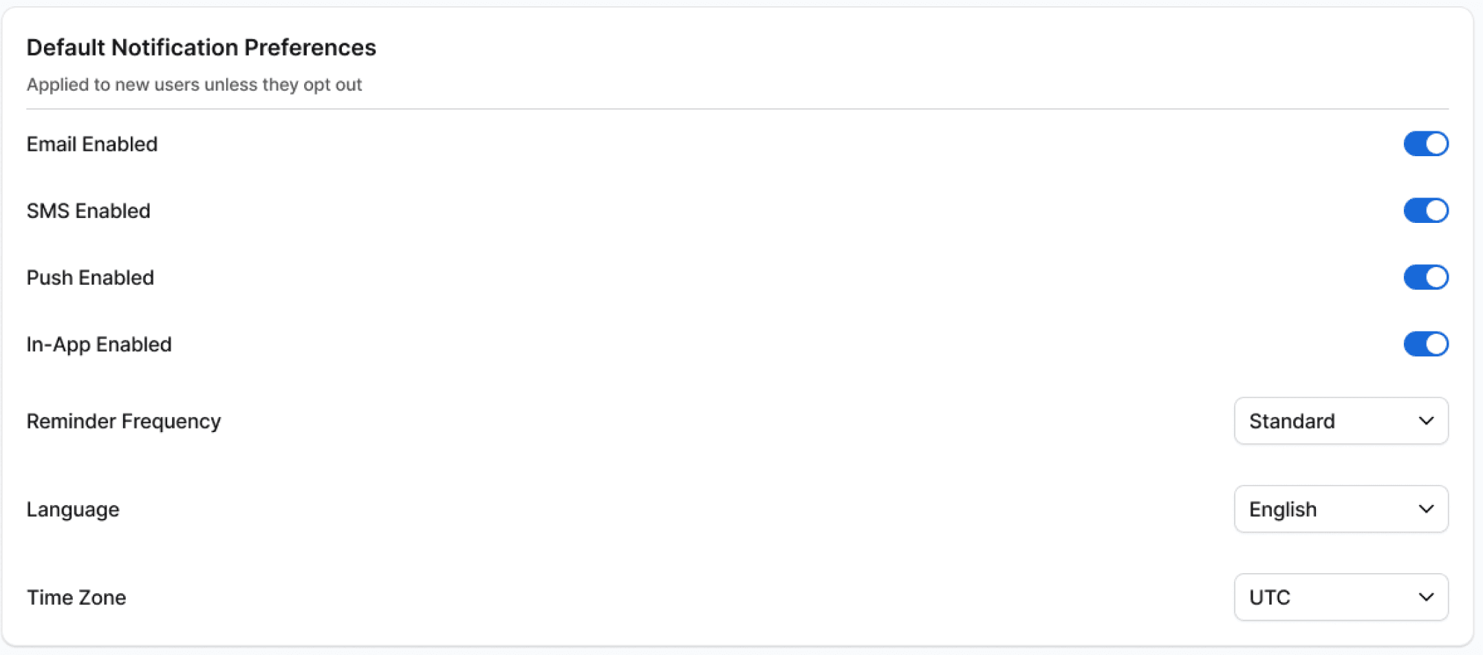
Original client preferences screen detail

CONSISTENCY ACROSS MODULES

Preference settings use labeled switches and dropdowns within the same card-based language.

The UI emphasis is practical: distinguish the section title, the field label, the current value and the action an administrator can take.

UI DESIGN SCOPE

Typography, color styles, reusable controls and screen-level composition. These are design artifacts; the product is under development, so implementation and usability outcomes are not claimed here.

10 / REQUIREMENTS & COLLABORATION

One month. End-to-end design ownership.

One month. End-to-end design ownership.

One month. End-to-end design ownership.

I was the sole UX/UI designer, reporting to the Creative Director and collaborating with developers and consultants across both admin experiences.

I was the sole UX/UI designer, reporting to the Creative Director and collaborating with developers and consultants across both admin experiences.

INPUTS

Governance model, role matrix, workflows and interface requirements.

DESIGN SCOPE

Provider setup, content, delivery controls, monitoring and investigation.

COLLABORATION

Design direction and implementation discussions with the project team.

11 / DESIGN OUTPUT & NEXT STEPS

Designed across both roles. Now under development.

Designed across both roles. Now under development.

Designed across both roles. Now under development.

The design covers configuration, templates, branding, delivery controls, scheduling, testing, monitoring and history for platform and tenant administrators.

The design covers configuration, templates, branding, delivery controls, scheduling, testing, monitoring and history for platform and tenant administrators.

DESIGN OUTPUT

A connected administration experience with a clear division of platform and client responsibilities.

A connected administration experience with a clear division of platform and client responsibilities.

NEXT VALIDATION PRIORITIES

Role clarity, provider setup, template publishing and failure investigation with real administrators.

Role clarity, provider setup, template publishing and failure investigation with real administrators.

Launch results and measured impact will be added when the product is available.

☰